
Consistent AI Design Without Headaches: Recraft Review
How to Make Ready-to-Use Visuals

This post is made in partnership with Recraft
Hello friends!
Last week, we broke down Vibe Designing and how modern tools let you turn creative ideas into reality way faster.
That said, speed isn’t the only thing worth optimizing. I believe that consistency above all is a must-have for great branding.
Think about any great brand, such as Netflix, HubSpot, Apple, or even that viral TikTok creator’s merch. You instantly recognize their vibe, right?
But keeping consistency is usually the hardest and most boring part of the job, let’s admit it🫠
And Recraft is here to back you up. I was using it as my sidekick, and actually not only me, as it is the go-to for 7M+ creators (trusted by Netflix, HubSpot, Ogilvy, as well!) across 200+ countries.
So today, we’re looking at Recraft and how it helps you stop policing your own damn work so you can actually focus on designing and making something bigger and better.
We’re going to spill on:
How Recraft nails Style Control using a curated style library.
How to stay 100% true to your palettes without constant manual checks
And how it lets you create a pro-level Streamlined Workflow.
Let’s go!
Christmas & EOY are coming! Thank you for being with us, and enjoy the Christmas Offer for Creators AI Full Access (limited in time)
What is Recraft
Recraft is an AI tool where you can create marketing‑ready images, illustrations, and graphics. The platform removes friction from consistent tasks so anyone can generate visual content from text fast without any design experience.
But Recraft is more than a picture generator. It’s a full set of AI-powered design tools, because you get deep result customization and options to process finished images for perfection.
By the way, in late 2024, Recraft’s V3 model hit the top spot on Artificial Analysis’ text-to-image leaderboard on Hugging Face, even beating Midjourney and OpenAI! In 2025, it remains in the top tier and gets recognized as a leading image model in TechCrunch, and Business Insider.
Key Features
Everything is intuitive, and it reduces repetitive manual work from the start. You can work on an endless board, throw multiple images on it, combine uploads, and mix in AI art side-by-side to manage entire campaigns in one view.
Your assets are instantly on-brand and cohesive. Train a custom style based on your stuff. You generate everything within your brand identity, making sure your assets always look like your work.
It allows switching between raster and vector modes easily. So you get editable SVG vector art where everything scales infinitely (great for consistent website illustrations, pixelated logos, icon sets).
It ensures palette and accessibility compliance, so you never worry about accidental color shifts.
You can generate marketing-ready visuals with Recraft’s Photorealism Styles. No need for complex photo setups.
Finally, you can fine-tune outputs after generation, by tweaking the details, moving on, and using mockups to check how your image looks on physical products (like, see your design on a mug or a t-shirt before you even send it to print!).
The Consistency Crusher: Style Control That Keeps You in Control
You know the drill: whenever you’re mocking up web designs or building presentations, stock sites become your second home. I used to literally sink hours trying to find decent shots, only to end up settling for something totally bland.
Recraft ended that headache. It provides several ways to keep a consistent look across multiple assets. You can apply the same preset style, create an Image set for related assets, or use a custom style to lock in a specific aesthetic. This ensures that logos, icons, and illustrations match across a project without having to regenerate from scratch. And if you have no ideas, there is…
The Curated Style Library
This is Recraft’s built-in collection of ready-made styles. You can instantly pick one to be the foundation for your work without typing up a single descriptive style prompt.

What this gets you:
The Library shows you everything that the Recraft model can do. It’s your visual cheat sheet.
You can choose a style and start generating images that immediately hit the right aesthetic.
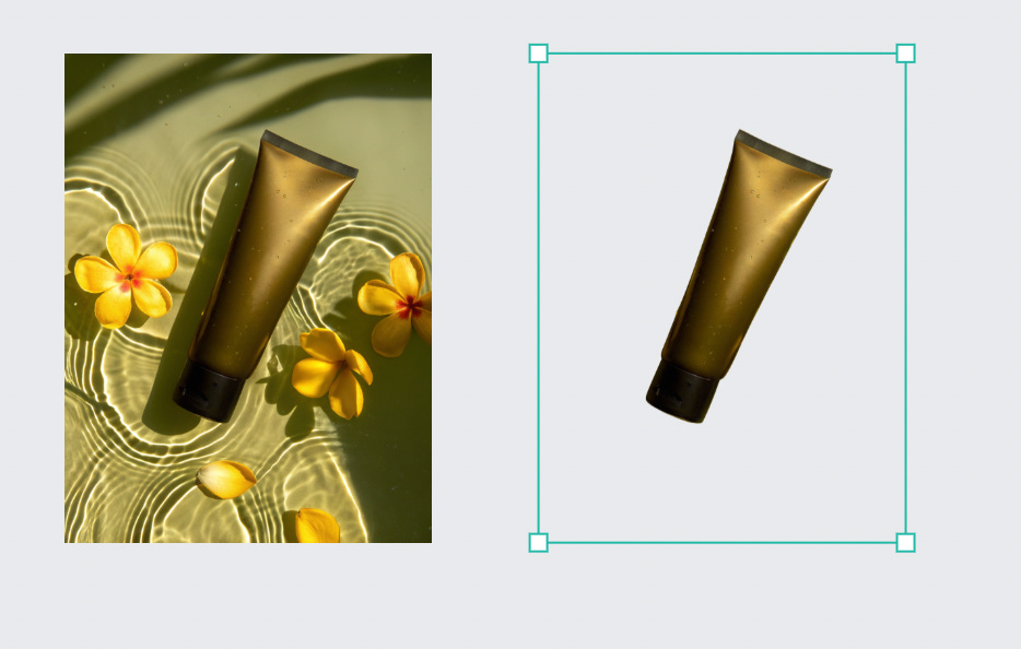
Say you are running a marketing campaign to push your new cosmetics brand. You need high-quality product shots, right? For example, I chose Recraft’s Photorealism and went for these lifelike images. Just grab these prompts and use them for your social media, product packaging, or even internal decks.
A glass jar of face cream in top-down product photography with a warm, sunlit aesthetic, crisp natural shadows, soft water ripple reflections, vibrant fruit accents, and a clean, minimal background that enhances the luxurious, organic feel.A tube of moisturizing lotion in top-down product photography with a warm, sunlit aesthetic, crisp natural shadows, soft water ripple reflections, vibrant fruit accents, and a clean, minimal background that enhances the luxurious, organic feel.A compact jar of night cream with a golden lid in top-down product photography with a warm, sunlit aesthetic, crisp natural shadows, soft water ripple reflections, vibrant fruit accents, and a clean, minimal background that enhances the luxurious, organic feel.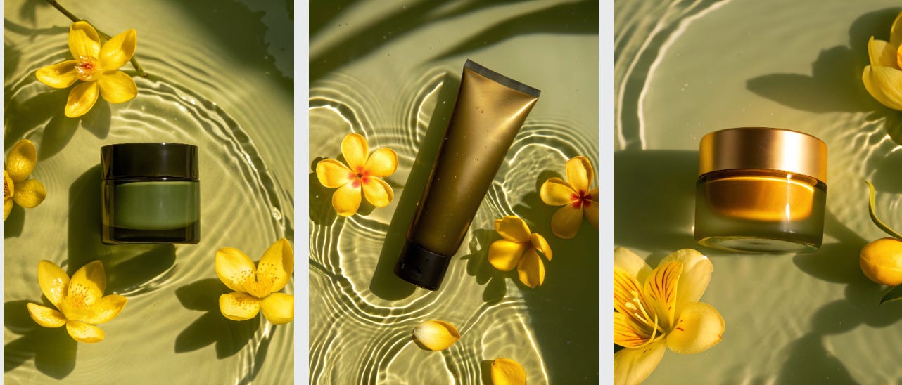
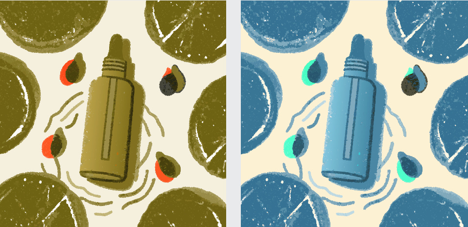
If you are feeling experimental, definitely try to explore other styles.
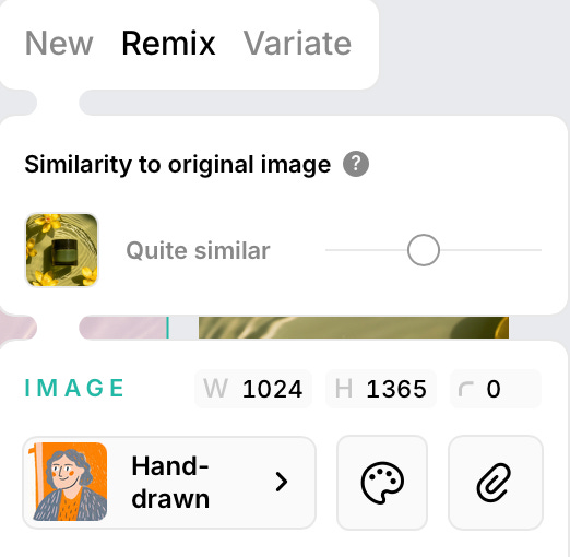
Take the photos above under the same prompts.
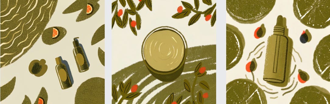
Then, in Remix mode, switch the style to Hand-drawn under the Illustration section in Remix mode.
Remember to lock in the colors and choose similarity from the original photo so the new drawing still feels on-brand
And boom! Look at these illustrations, you can end up with. They can seriously let people see the brand through totally different eyes.
Quick Campaign Kickoff
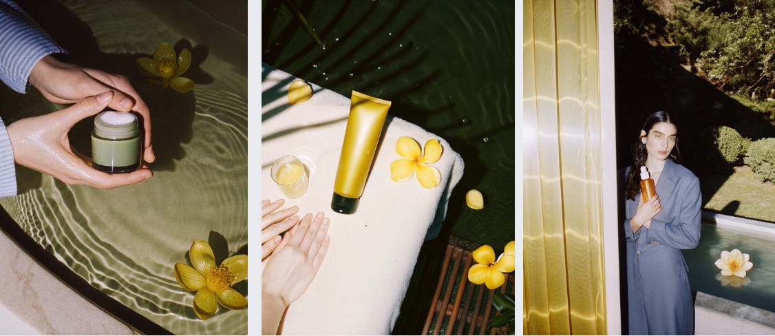
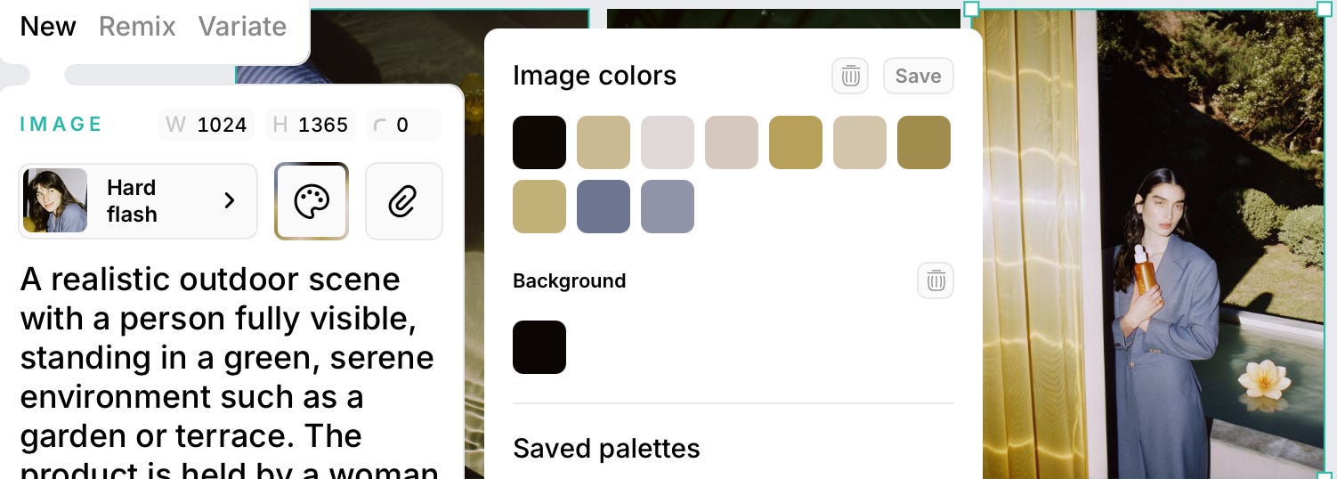
What’s a campaign without people, and especially no logo, right? So, I took initial product shots as a base, but used Hard Flash Style to create stock-like, editorial-quality visuals. The results are fire!
There are prompts:
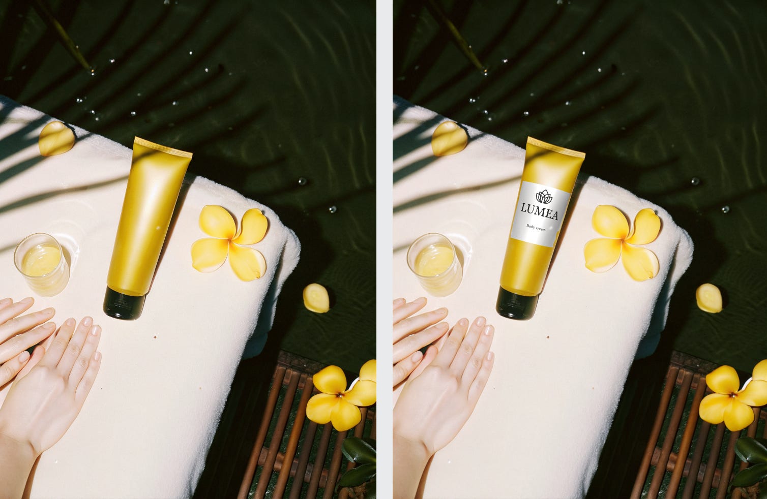
A cinematic lifestyle shot focused on human hands interacting with the product. Soft daylight, natural skin tones, clean manicured hands gently holding the jar above a textured surface. Minimalist styling, organic shadows, calm and premium mood. The product feels integrated into a real moment, not staged. Balanced composition, tactile and intimate atmosphere.A natural outdoor lifestyle scene in a garden or terrace setting. A person seated casually, hands resting near the product, sunlight catching skin and glass. Face turned away or cropped, focus on body language rather than identity. Soft diffused daylight, subtle wide-aperture separation, relaxed and effortless vibe.A realistic outdoor scene with a person fully visible, standing in a green, serene environment such as a garden or terrace. The product is held by a woman with a beautiful face, confidently at chest level, integrated naturally into the moment. Sunlight is diffused and soft, creating smooth highlights and a shallow depth (f/2.8 feel). Clean composition, modern wellness vibe.To add a logo, you don’t need to regenerate the entire photo, but simply put your design onto an existing object with the same lighting and materials.
Upload your base: Take any photo of a bottle or packaging (I used the cream image above).
Use the Mockup tool: Select the object and click “Make mockup” on the bar above.
Place your design: Upload your file and place it on the object.
It feels like something is off…to my mind, the towel looks unnaturally white. To finalize the look, we can use Nano Banana Pro for the last edits to express that calm feeling.
Change the towel color to a soft, warm beige.
Make the color even and clean across the whole towel.
Keep the texture realistic and natural.
Do not change the product, hands, flowers, and lighting.
Preserve the original composition and mood.
Do not change the bottle shape, material, or color.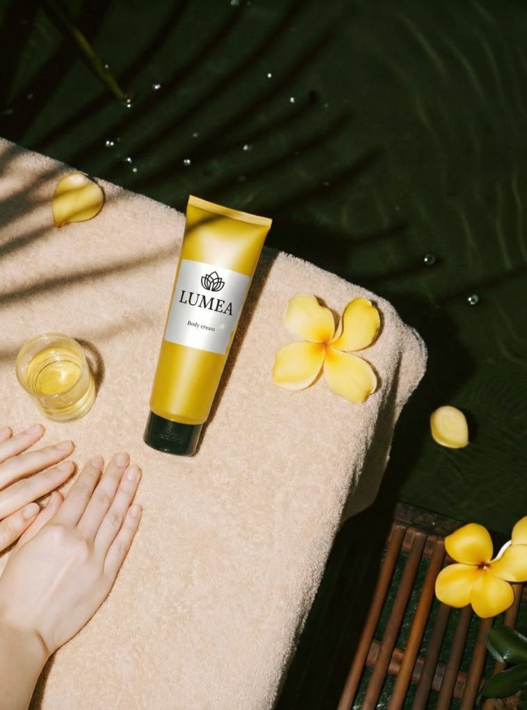
So there you have it, the whole campaign is loaded. Seriously, Recraft lets you build an approach that turns your product visuals into a fully flexible system. You can update, iterate, and scale content on demand, without getting totally jammed up in those old-school production cycles.
Custom Presets: Ensuring Your Brand’s Look
This is the real powerhouse of Style Control. It lets you bake in your own unique style and save it as a preset, so it gets slapped onto all your future generations.
You can train Recraft on your own style by uploading existing brand assets (logos, illustrations, color palettes). This guarantees the AI cranks out content that perfectly matches your signature aesthetic.
✨ What You Can Create Using Style Control
By locking in a fixed or custom style, you can create entire asset packs where every single element matches the last one:
There is a simple tutorial that walks you through the full flow — from uploading up to 5 images to saving and sharing your own style - CLICK
Color control
Recraft gives precise control over colors in both generation and editing. You can apply predefined or custom color palettes (via hex codes, eyedropper, and extracted from an image) to maintain brand consistency. For vectors, individual or grouped colors can be adjusted with swatches or spectrum editing.
What you can actually do with this:
You can force your exact corporate colors onto an entire icon set.
Pull the colors straight out of a beautiful campaign photo to instantly create a matching palette for social graphics. This gives you instant consistency without manual color picking.
Need to change your seasonal color scheme? You can recolor plenty of vector illustrations (e.g., swapping all greens for blue) in one click. This can be done with Recraft’s Vectorization feature.
Important note: Vectorization is most powerful for logos and illustrations!
So, I took an illustration produced earlier to show how to use it.
Step One: Choose your campaign illustration.
Step Two: Vectorise It ( that function is right there on the top panel).
Step Three: Play with Color. Now you can totally swap out colors and shades, and the quality of the illustration won’t degrade at all, no matter what wild color flip you make.
The Recraft Workflow: Hit the Launch Button
The entire point of Recraft is to get rid of endless revisions and slow approvals. Everything we’ve talked about — from the initial generation to the final polish — is what creates the Streamlined Workflow.
1юTotal Creative Control
The platform puts the power right in your hands, whether you’re a marketer needing campaign visuals or a designer perfecting brand assets. You create images and immediately choose the perfect look.
Locking in Consistency
This is the key to fewer revisions. Recraft’s power comes from turning those photorealistic images into a flexible system by combining them with its professional features, such as forcing your exact corporate colors and custom presets, vectorising, changing a style, and using prepared templates.
Post-Generation Editing
Even if the generated image is 99% there, you don’t have to restart. Recraft lets you refine the visuals without beginning from scratch.
Ready-to-Use Ideas for you
A/B Test EVERYTHING in Real-Time
Generate two slightly different Custom Presets (e.g., “High Contrast” vs. “Soft Focus”).
Apply Preset A to 50% of your assets, Preset B to the other 50%.
Instant Language Localization
Generate an image containing editable text (e.g., a package label).
Use Inpainting with an External Model (like Nano Banana) to remove the English text and instantly replace it with Spanish, Japanese, and so on.
Hyper-Personalized Ad Mockups
Create a Medium Shot with the Model.
Use Inpainting/Edit Area to quickly change the model’s clothing or hairstyle to match a specific target.
Product Placement Swap
Generate an image with your product on a kitchen counter.
Use Edit Area/Inpainting to quickly swap your product onto a beach towel, then a car dashboard, then a hiking backpack.
The Bottom Line
Because you have this integrated control, you skip the usual creative drama. Personally, I’m all about using it for web design. When I need to nail the page layouts and the overall site logic, Recraft seriously saves a ton of time on cranking out different visuals.
The best part? All the assets are consistent, polished, and ready to go, which leads to way fewer revisions and significantly faster approvals. It just keeps the whole design process moving!
This is awesome. I've been struggling to take advantage of all of the AI image creation/editing tools in part because it seems a) having an innate sense of style and taste is pretty much tablestakes and b) knowing how to prompt your tool of choice is very important in terms of setting the scene and art direction.